Complex Search, Licensing & Checkout Experience
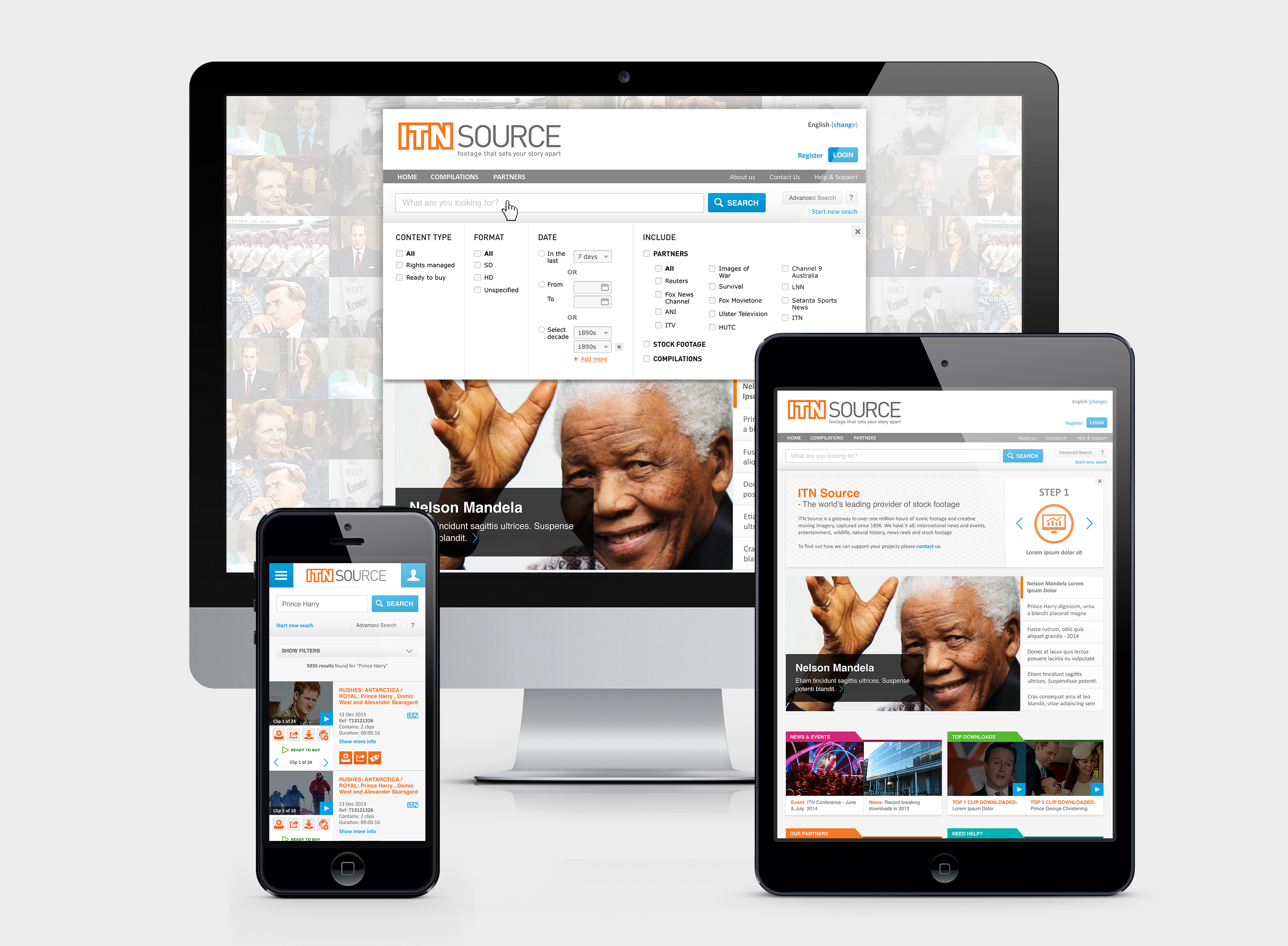
Responsive interface concepts across desktop, tablet and mobile views.
Overview
As part of the design team at Global Beach, I worked on the redesign of ITN Source – a licensing portal used by production companies, broadcasters and media professionals to search, preview and license archival footage.
The platform handled a large content library, multiple licensing models and varied purchasing paths. The redesign focused on improving clarity across search, selection and checkout flows while supporting complex licensing logic. I collaborated closely with a UX designer to shape structure, interaction patterns and interface design across the platform.
Result: The redesigned platform contributed to a reported 200% increase in online sales.
Platform Context
The portal served a global professional audience and managed a large archive of licensed content.
Key characteristics included:
• Over 1 million video clips• ~15,000 active users
• ~260,000 visits per month
• Multi-lingual & multi-currency
• Complex rights-managed and ready-to-buy licensing models
• Reported increase of up to 200% in online sales following platform improvements
The redesign was introduced in phases to accommodate the platform’s scale and technical complexity, meaning some screens reflect different stages of the evolving interface.
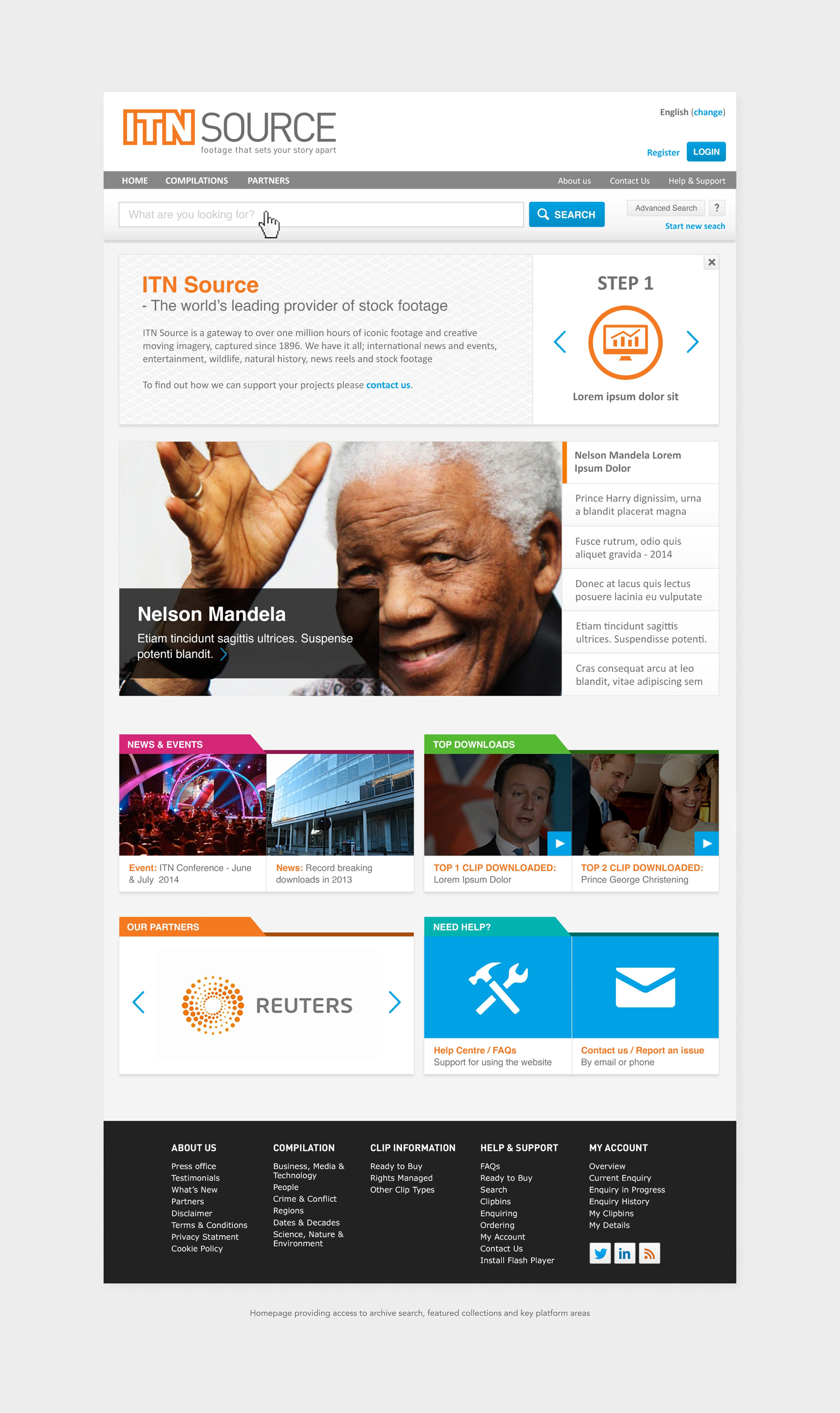
From the homepage, users typically began by searching the archive or browsing featured collections before moving into detailed search and licensing workflows.
My Role
I worked closely with a UX designer throughout the project, collaborating on structure, flows and interaction logic.
My focus was on translating complex licensing rules and system states into clear layouts and interactions, helping users understand available content and purchase paths.
Key contributions included:
• Interface design and visual hierarchy
• Interaction patterns across search and licensing flows
• Translating UX concepts into high-fidelity UI
• Designing system states and behaviours across the platform
• Structuring complex information so the experience remained clear and manageable
This was one of the first projects where I worked deeply within a complex multi-state system, and it sparked my long-term interest in designing structured product environments.
Key UX Challenges
The platform needed to support a wide range of content types and licensing models, creating complexity across search, selection and checkout.
Key challenges included:
• Helping users distinguish between content that could be purchased instantly vs content requiring enquiry
• Structuring search results across multiple views and filters
• Supporting both collection purchases and individual clip licensing
• Designing a checkout flow that handled different licensing paths
• Ensuring a complex system remained clear and navigable
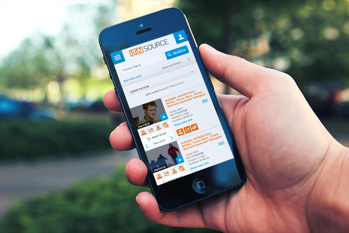
Mobile interface supporting archival search and browsing
Designing the System
Search & Archive Exploration
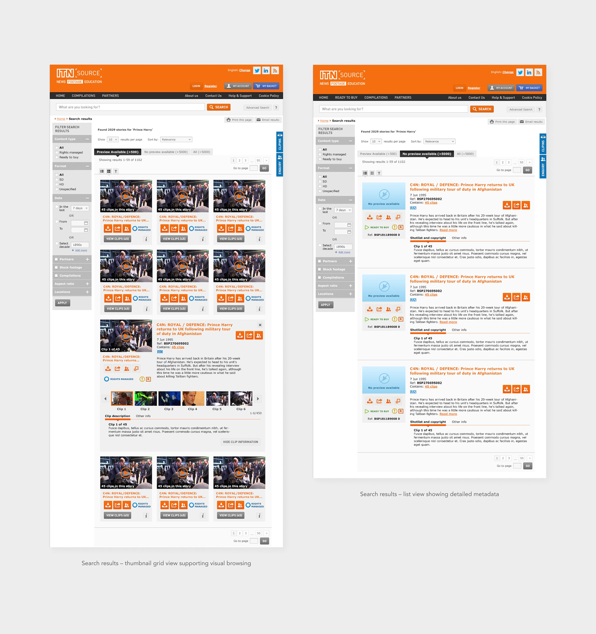
A significant part of the redesign focused on improving how users explore a very large archive of footage.
I designed the UI and interaction patterns for:
• Search bar with dropdown panel for advanced search options and filters
• Dedicated advanced search page combining keyword queries and filtering
• Metadata-based filter panel interactions
• Date-based search using a calendar interface
• Multiple result views (list, thumbnails and text)
• Supporting states such as no results and content without preview
The goal was to make the search experience flexible without overwhelming users, supporting both highly specific queries and broader exploration while keeping large volumes of information clearly structured and easy to navigate.
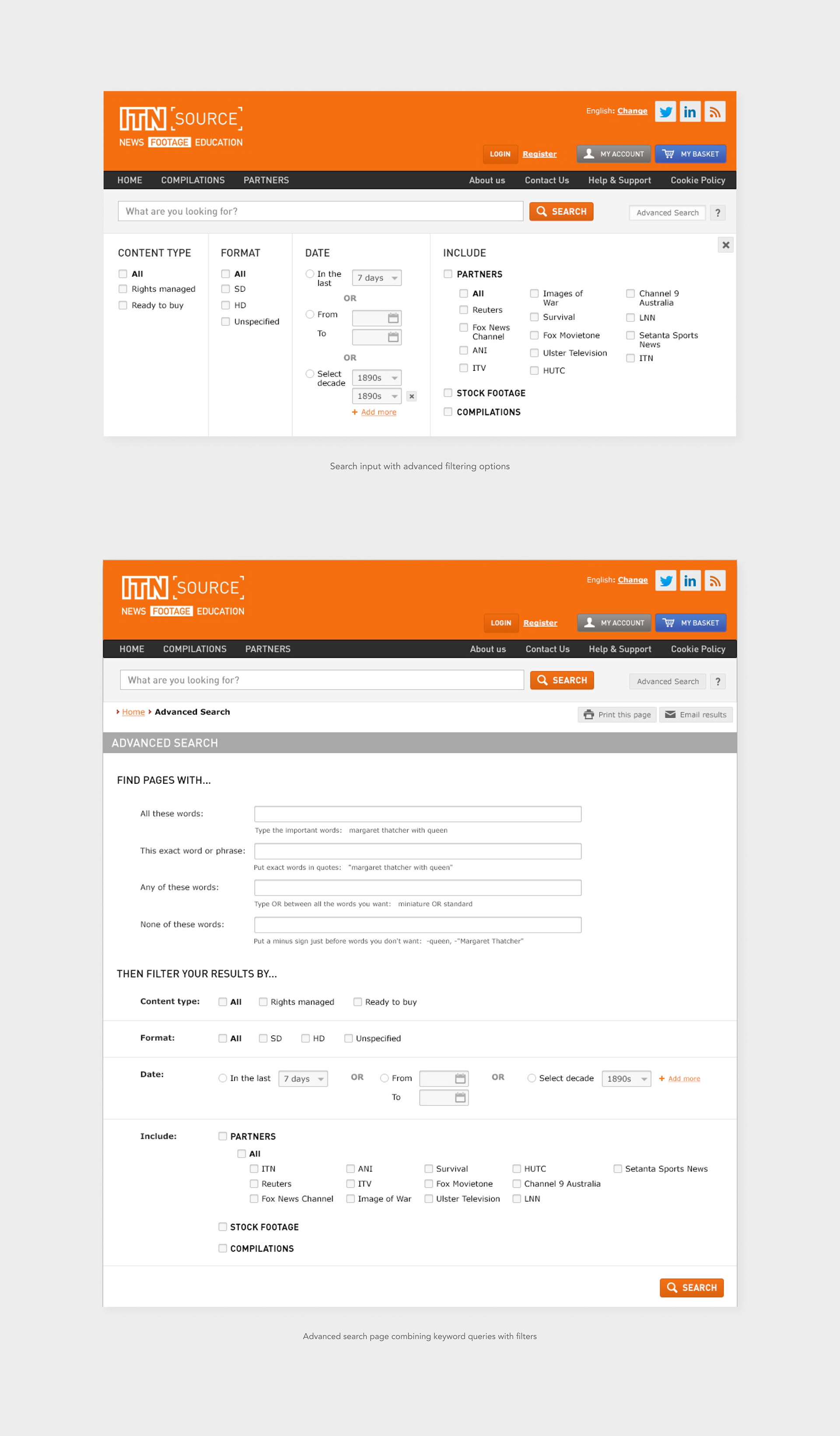
Results could be explored through metadata-focused list views, visual thumbnail grids and compact text views, supporting different browsing behaviours and levels of information density.
Design insight
The challenge was balancing flexibility with clarity, allowing users to perform precise archival searches without overwhelming them with metadata.
The challenge was balancing flexibility with clarity, allowing users to perform precise archival searches without overwhelming them with metadata.
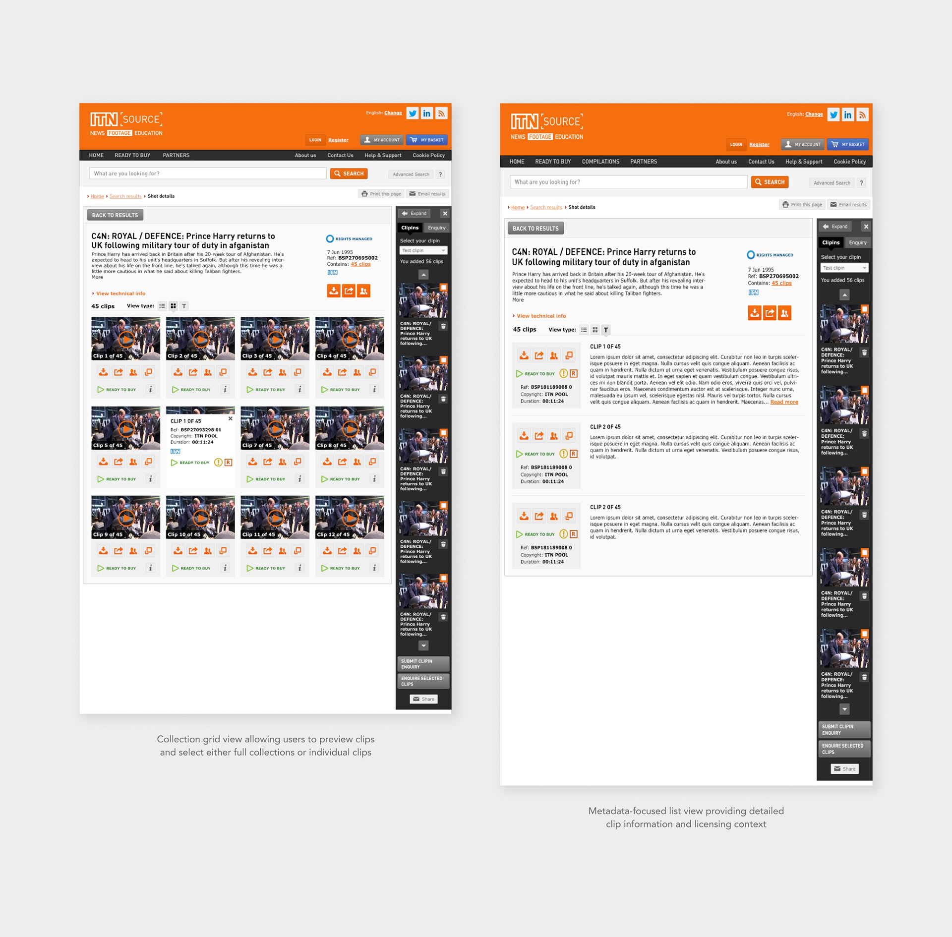
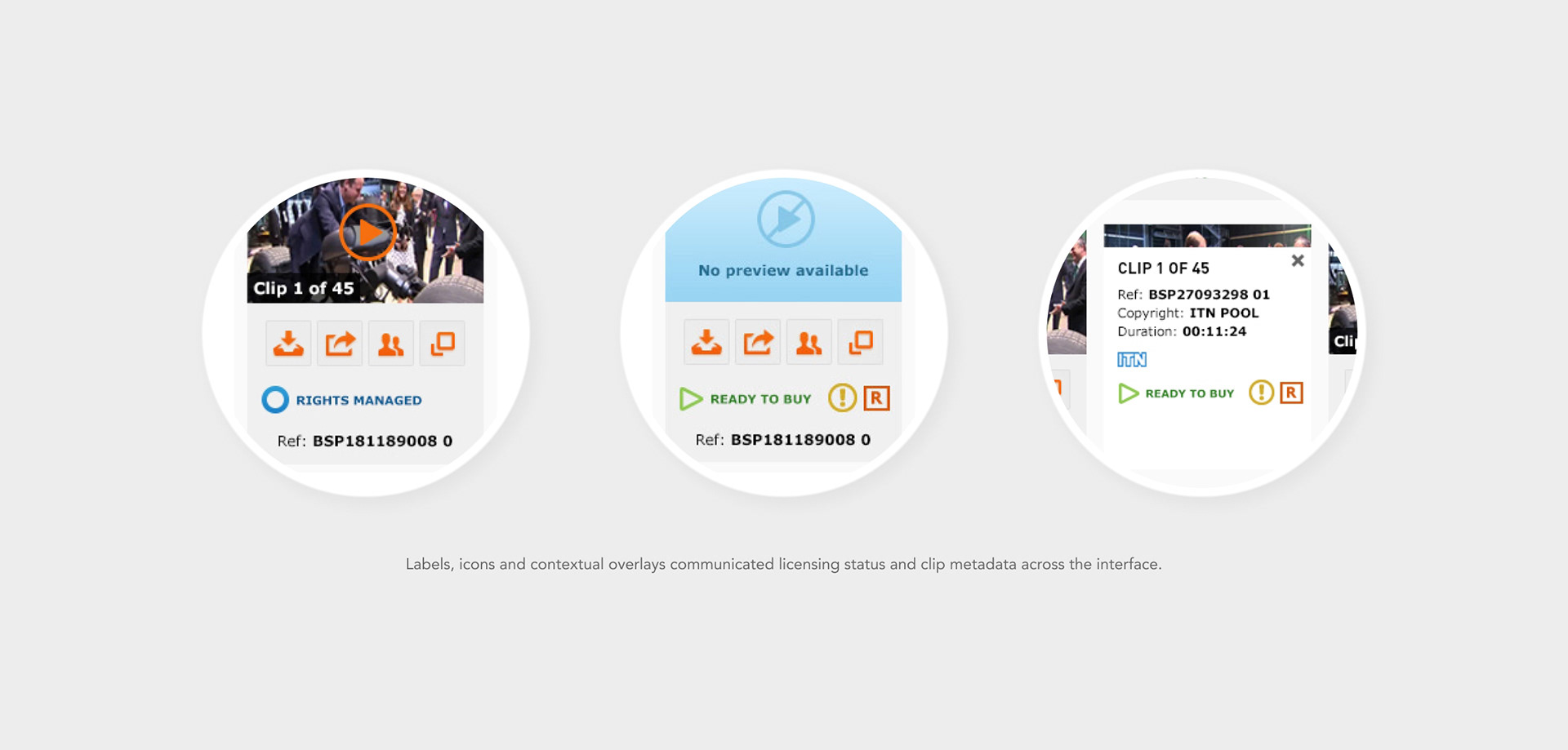
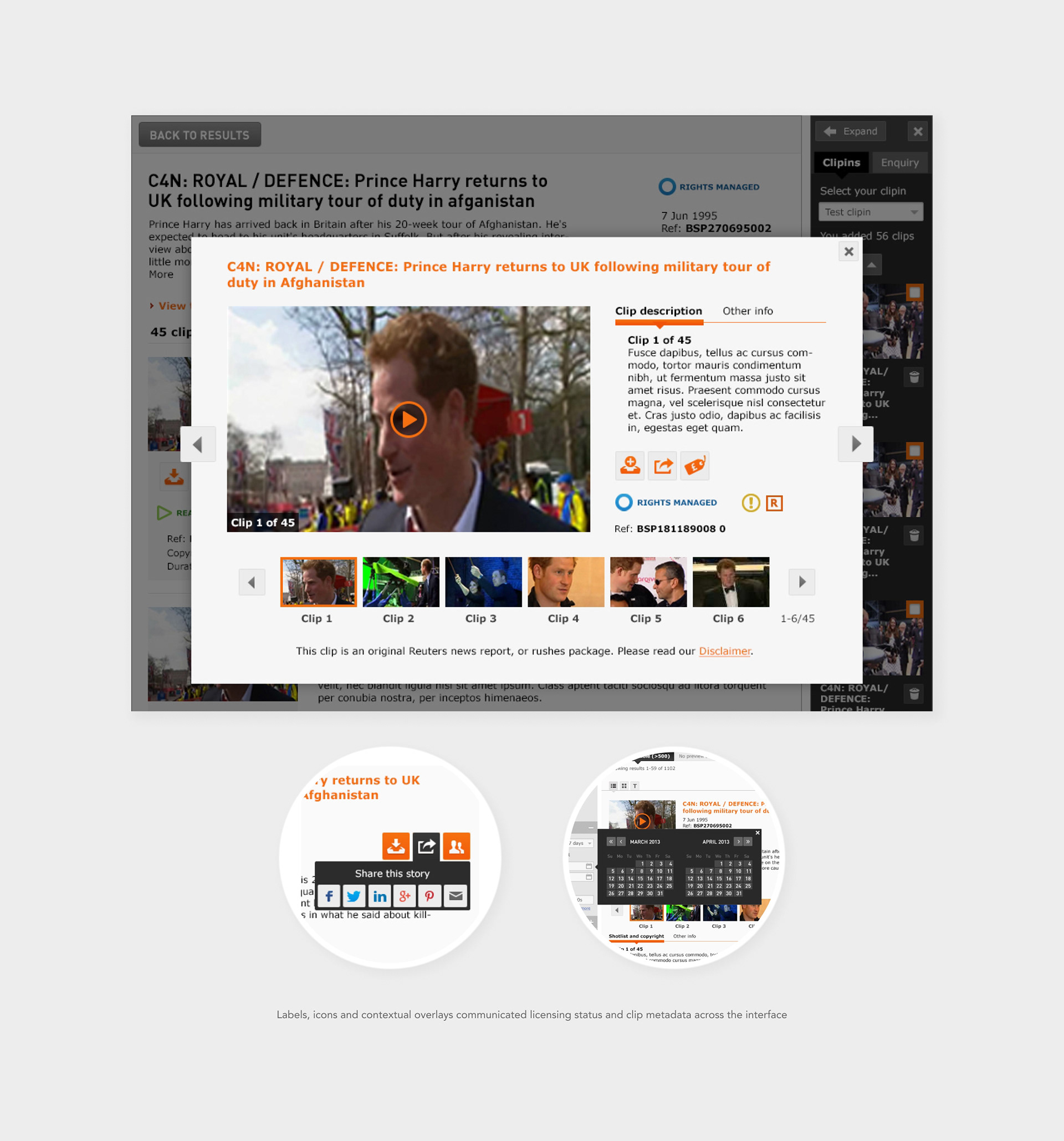
Content Selection & Licensing
Users needed to be able to add either entire collections or individual clips to their basket, which introduced both structural and visual complexity.
To clarify these options, I designed:
• Clear visual hierarchy distinguishing collections from individual clips
• Clear visual hierarchy distinguishing collections from individual clips
• Signposting icons and labels to guide selection and decision-making
• Tooltips and contextual information panels explaining available actions
• Licensing overlays such as “Choose your licence”
These elements helped users understand what they were selecting and what actions were available within the licensing workflow.
These elements helped users understand what they were selecting and what actions were available within the licensing workflow.
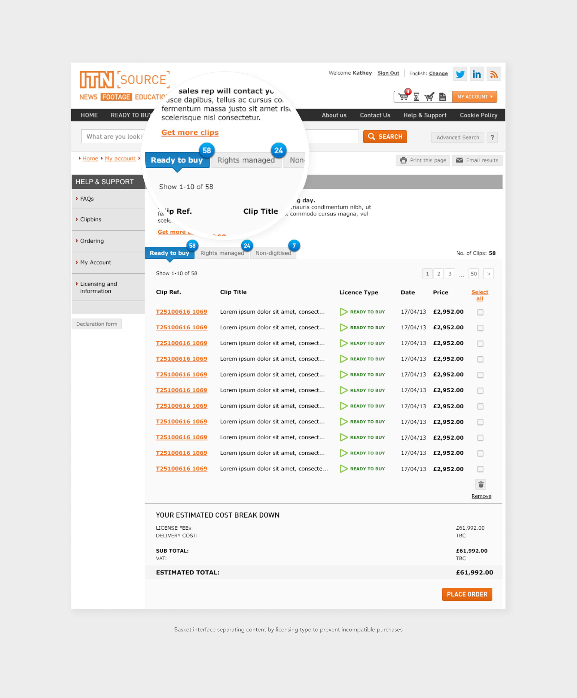
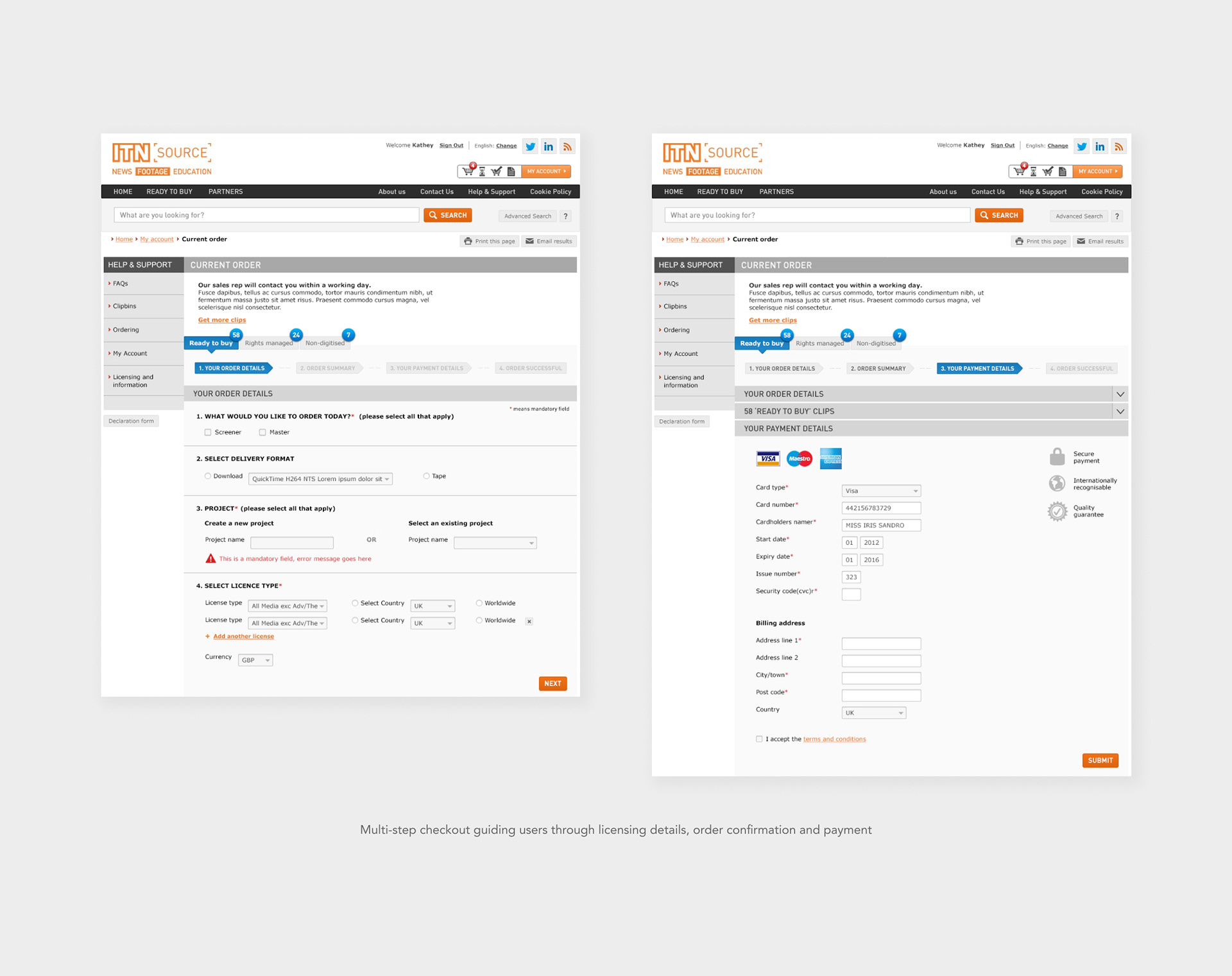
Checkout Flow & Licensing Logic
One of the most complex parts of the platform was the checkout experience. Different types of content could not always be purchased together due to licensing requirements.
To address this, we designed a basket system that separated items based on licensing type, helping users clearly understand which clips could be purchased immediately and which required an enquiry.
Key elements included:
• Side-panel basket interaction
• Side-panel basket interaction
• Separate baskets for ready-to-buy, rights-managed, and non-digitised content
• Breadcrumb-based checkout steps
• Structured payment form layout
This structure helped users clearly distinguish between:
• Content that could be purchased instantly
• Content that could be purchased instantly
• Content requiring licensing approval
• Content requiring additional processing
Design insight
Separating licensing types within the basket helped users understand which clips could be purchased instantly and which required approval
Separating licensing types within the basket helped users understand which clips could be purchased instantly and which required approval
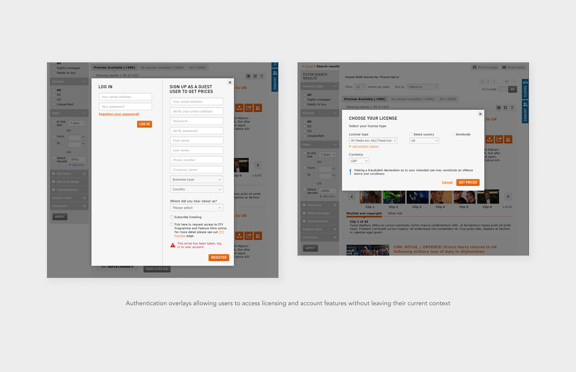
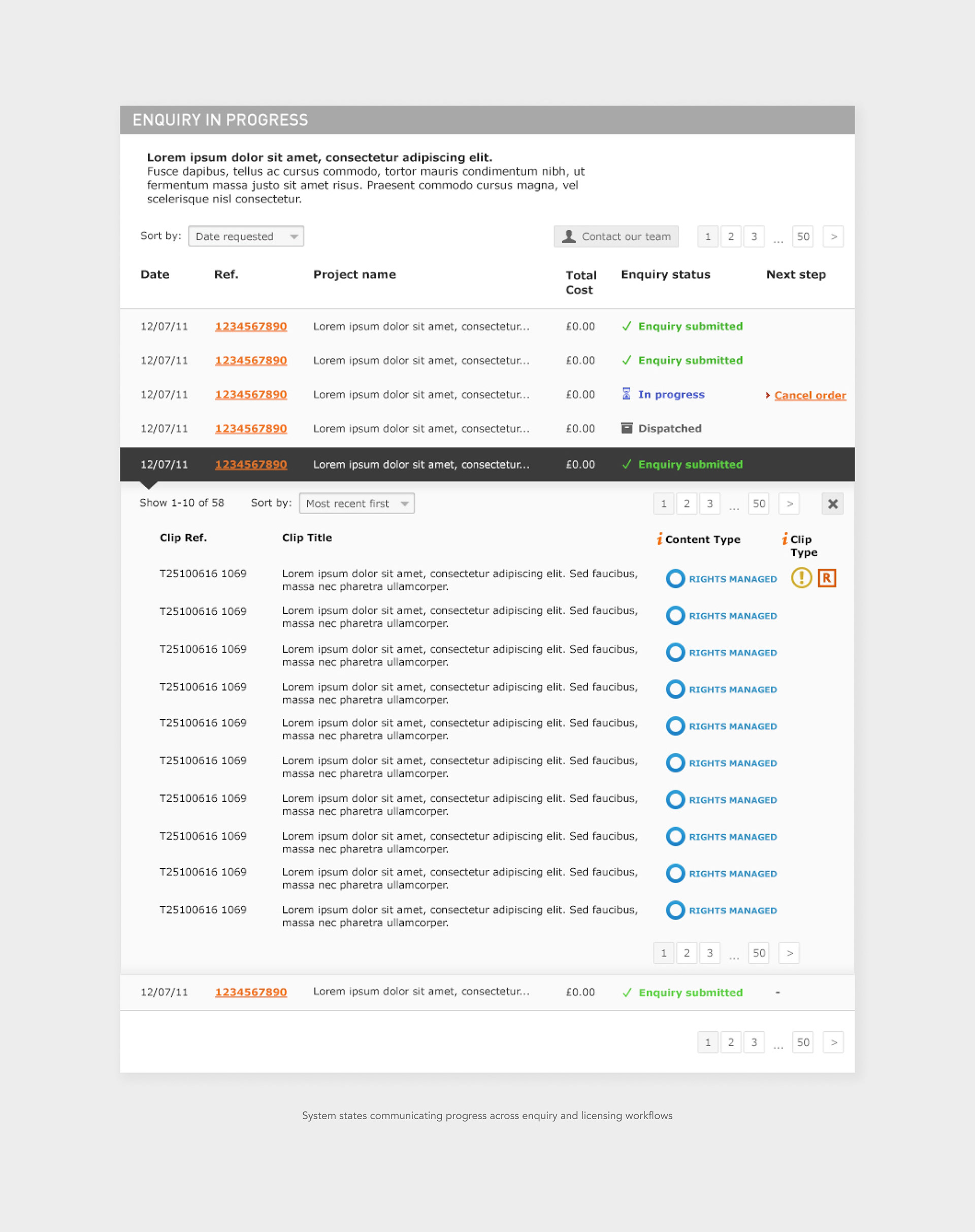
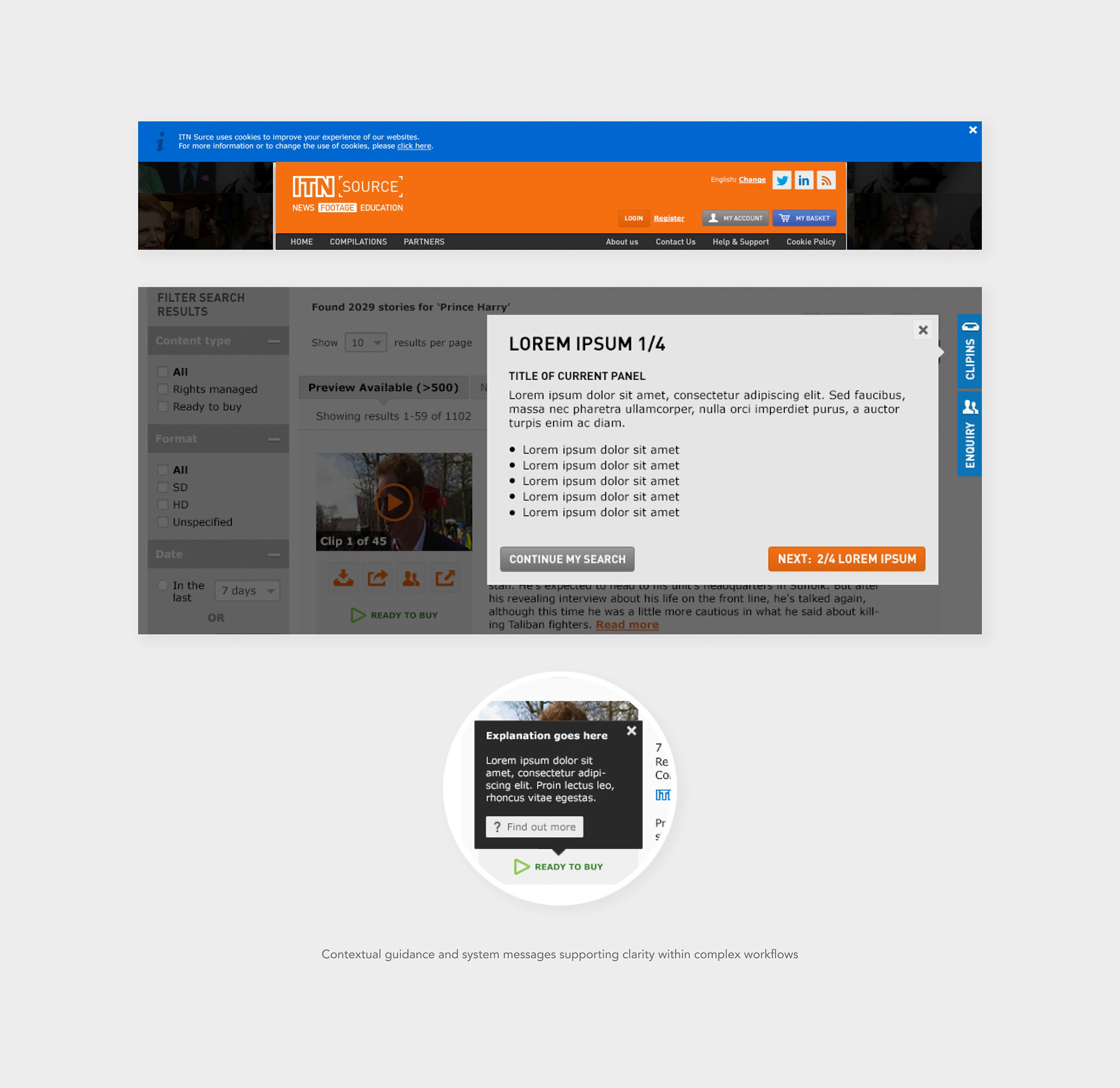
System States & Interactions
The platform required a wide range of supporting states and interactions to guide users through complex licensing workflows.
I designed numerous interface behaviours including:
• Login and sign-up overlays
I designed numerous interface behaviours including:
• Login and sign-up overlays
• Video preview interactions
• Enquiry workflow states (submitted, in progress, dispatched, completed)
• Contextual tooltips and information panels
• System messages and cookie notices
• Guidance overlays supporting key actions
These interaction details helped ensure the system felt predictable and manageable, even when users were navigating complex licensing scenarios.
These interaction details helped ensure the system felt predictable and manageable, even when users were navigating complex licensing scenarios.
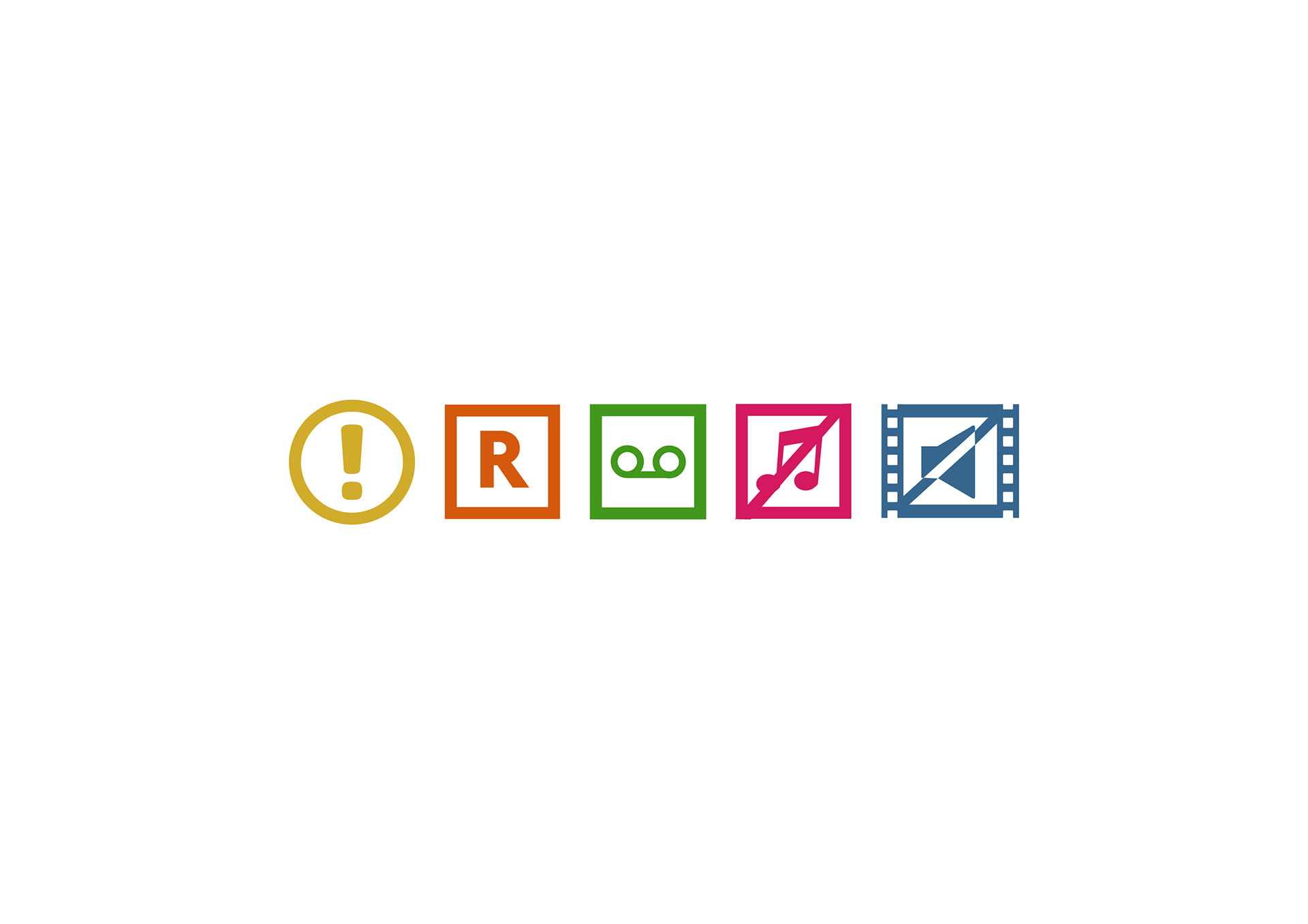
Content type icon system
Secondary CTA button loading state
Primary CTA button loading state
Design insight
Designing clear system states and contextual feedback was essential to making a complex licensing platform feel predictable and manageable.
Designing clear system states and contextual feedback was essential to making a complex licensing platform feel predictable and manageable.
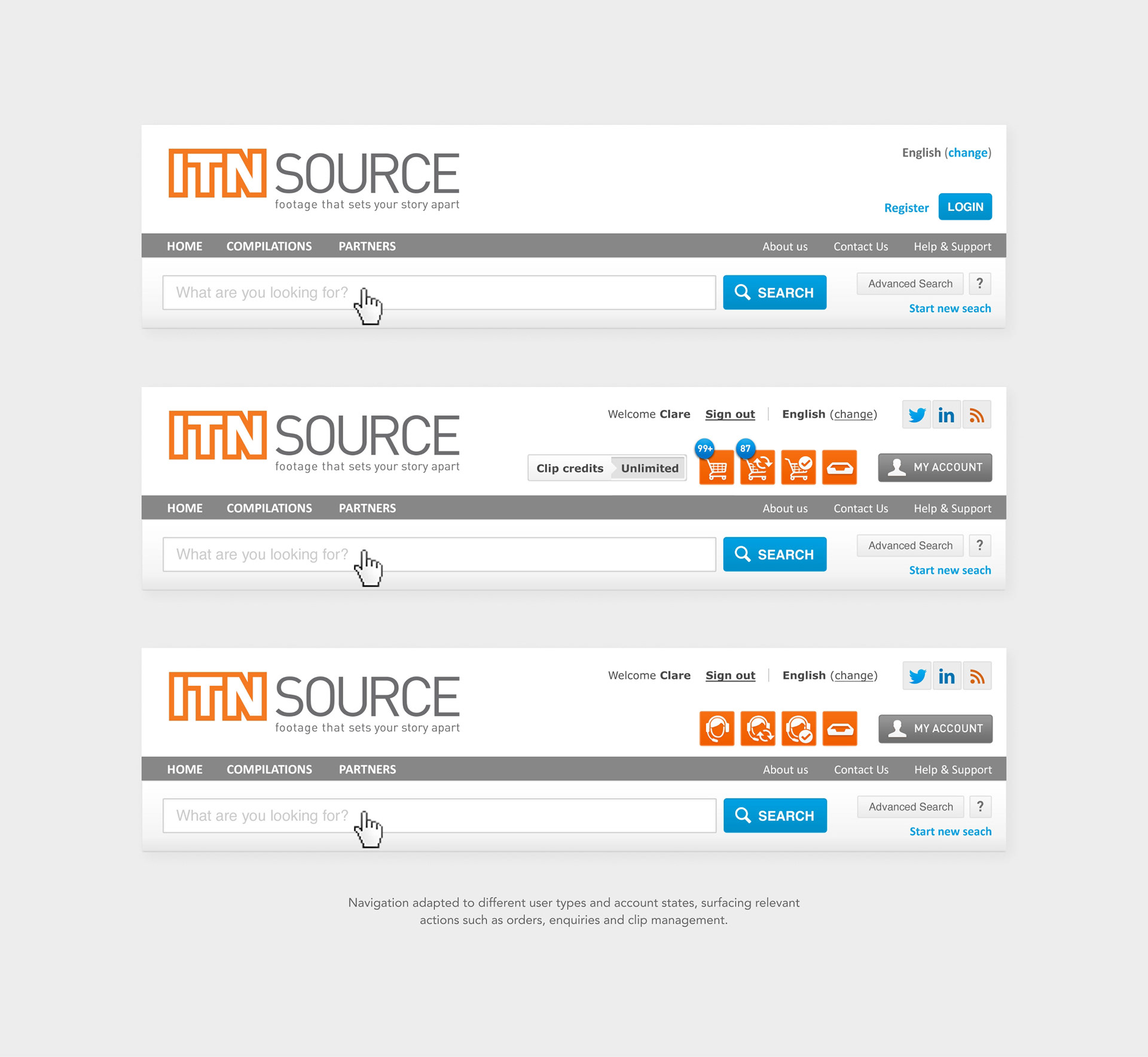
Navigation & Account States
Navigation adapted based on user type and payment model, including guest users, credit card users and account-based users with different credit levels.
The interface surfaced relevant actions such as orders, enquiries and clip management depending on the user's context.
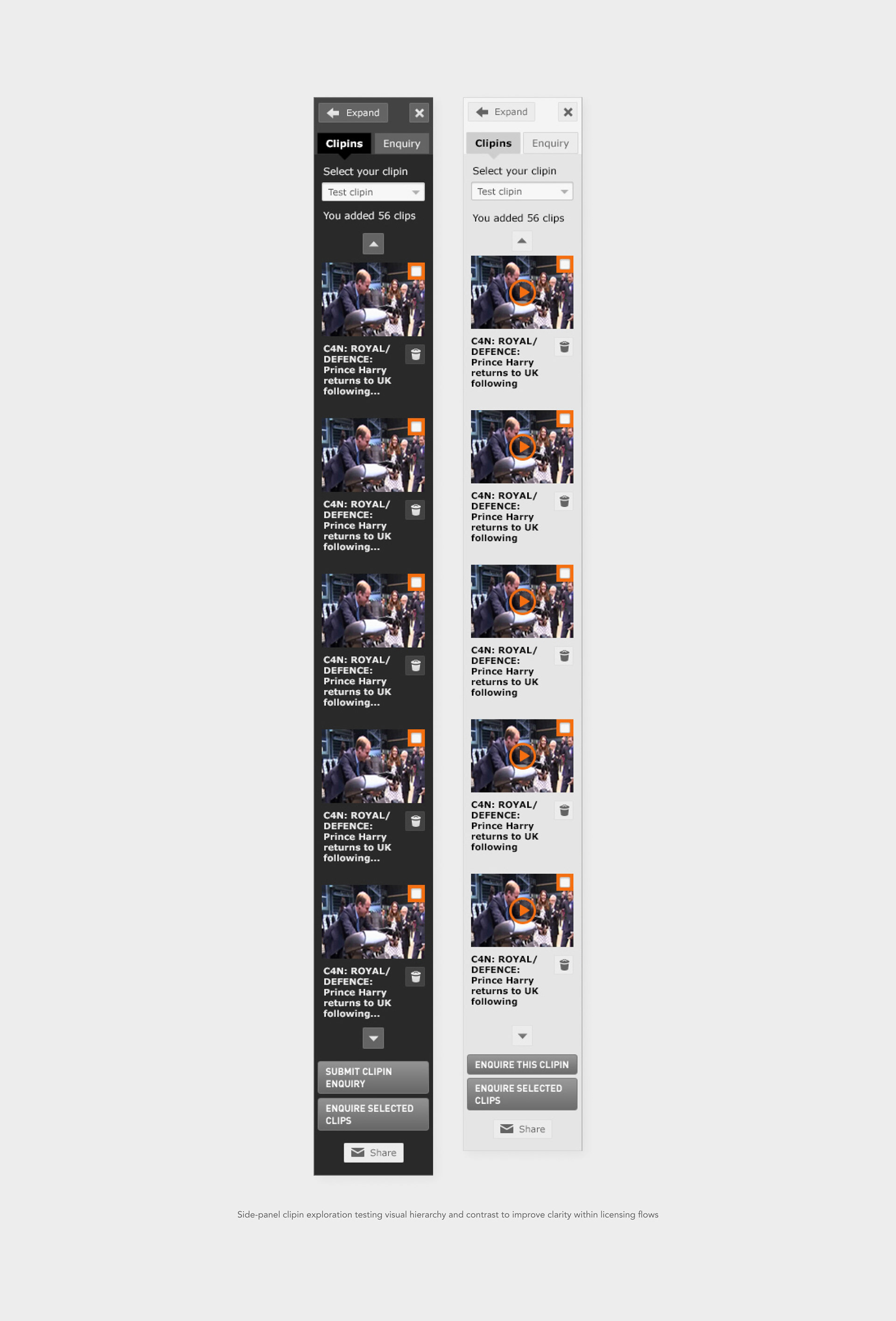
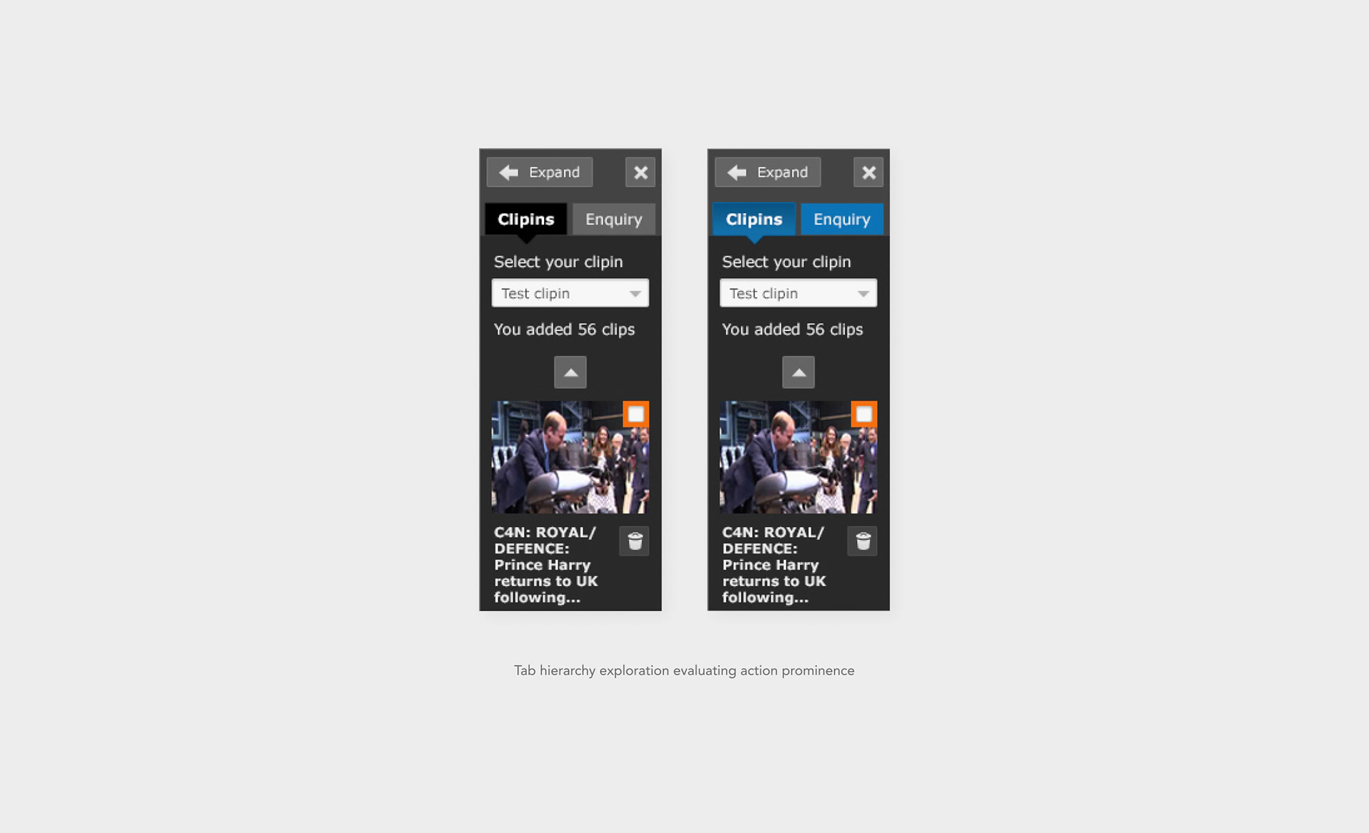
Design Iteration & Exploration
During the design process, I explored variations in structure and visual hierarchy to improve clarity within the platform’s more complex interactions.
• Side-panel basket visual variations (light vs dark)
• Tab hierarchy options
• CTA hierarchy based on licensing context
These iterations helped refine how users understood navigation and available actions within the system.
Design insight
These explorations helped validate which visual treatments made system states and available actions most immediately understandable.
These explorations helped validate which visual treatments made system states and available actions most immediately understandable.
Outcomes & Impact
The redesigned portal improved clarity across search, selection and licensing flows within a highly complex archive system.
Reported outcomes included:
• Up to 200% increase in online sales following the redesign
• Up to 200% increase in online sales following the redesign
• Increased engagement with the platform
• Continued use by a global professional audience
What This Project Represents
This project demonstrates my approach to designing complex digital systems where structure, behaviour and usability are as important as visual design.
It involved:
• Translating complex business logic into clear user experiences
• Translating complex business logic into clear user experiences
• Designing multi-state systems across large platform
• Collaborating closely with UX and engineering teams
• Structuring interfaces that support scalability and clarity
The project reinforced my interest in working on structured digital products where business logic, usability and design clarity must coexist.