iOS app design – translating a complex peer-to-peer booking model into a clear, intuitive mobile experience
UI design for a peer-to-peer private jet seat booking iOS app – translating complex booking logic into a clear, intuitive mobile experience.
Overview
Victor Echo was a companion iOS app to Victor's private jet charter platform, designed to make private jet travel accessible at near business class prices. Users could book individual seats on scheduled private flights, sharing the charter cost with other passengers. They could either join an existing flight or schedule their own – with the flight only confirmed once enough seats had been reserved.
I was responsible for translating UX wireframes into high-fidelity UI across the full user journey, working from paper sketches through to implementation-ready screens.
The Challenge
The core design challenge was communicating a genuinely complex booking model simply and clearly on mobile.
Unlike a standard flight booking, Victor Echo had:
• Two distinct user roles – flight creators and seat bookers, each with different views and actions
Unlike a standard flight booking, Victor Echo had:
• Two distinct user roles – flight creators and seat bookers, each with different views and actions
• A conditional confirmation model – flights only proceed when a minimum number of seats are reserved
• Real financial stakes – users were committing thousands of pounds, with refund conditions depending on whether the flight confirmed
Every screen needed to answer three questions at a glance: what's the current status of this flight, how many seats are needed to confirm it, and what can I do right now?
Every screen needed to answer three questions at a glance: what's the current status of this flight, how many seats are needed to confirm it, and what can I do right now?
My Role
• Translated UX wireframes and product team concepts into high-fidelity iOS UI
• Worked from paper sketches through to polished, implementation-ready screens
• Designed all system states and edge cases across both user flows
• Prepared detailed design specifications and assets for development handoff
From Wireframes to High-Fidelity UI
I received UX wireframes from the product team as a starting point. Before moving into high-fidelity design, I worked through the screens with my own paper sketches — helping me think through the interaction logic, states and edge cases more thoroughly before committing to pixels. From there I translated everything into polished, implementation-ready UI.
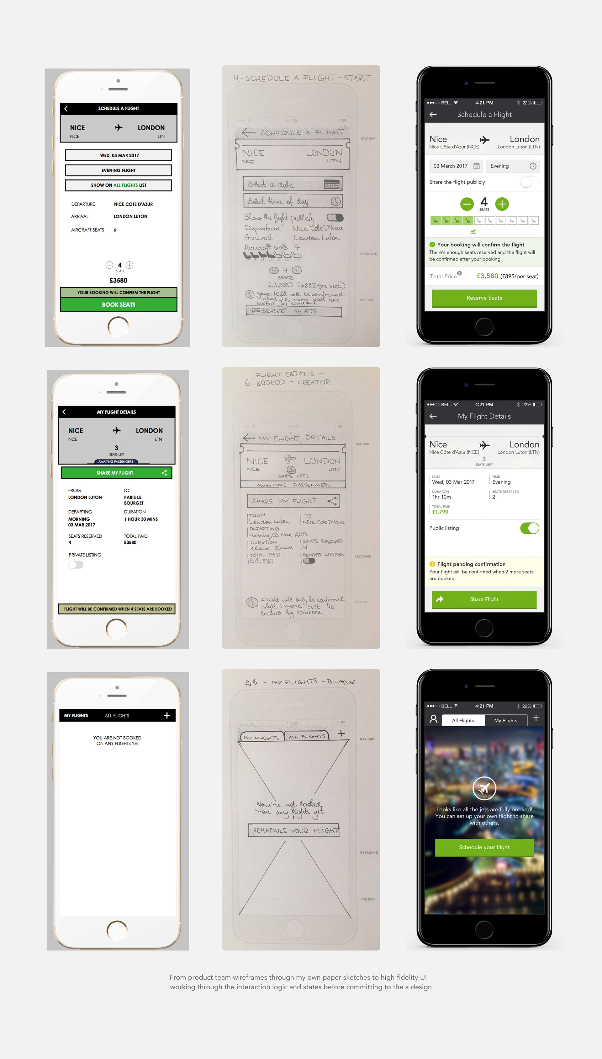
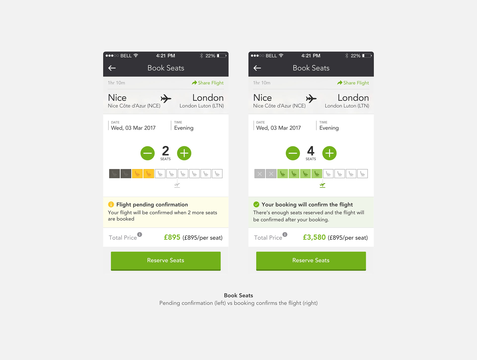
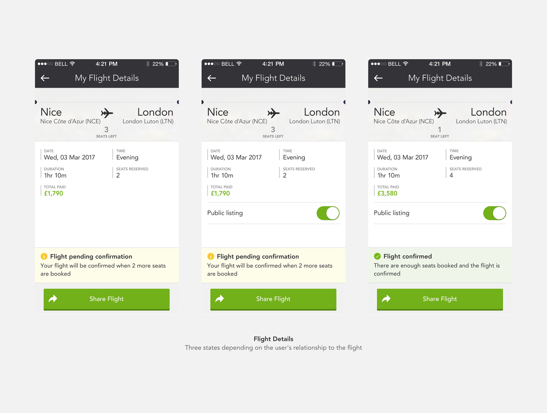
The Key Design Problem: Communicating Seat Status
The most interesting design challenge was the seat visualisation – making it immediately clear to a user booking seats how many were already taken, how many they were booking, and crucially whether their booking would confirm the flight or not.
The solution:
A row of seat icons using a three-state colour system:
A row of seat icons using a three-state colour system:
• Dark/disabled – already booked by others
• Yellow/amber – seats the current user is selecting (pending confirmation)
• Green – enough seats booked, flight will confirm
• Grey outline – remaining available seats
A small jet icon below the row marked the confirmation threshold – showing at a glance how many seats needed to be booked for the flight to proceed.
This meant users could understand the entire booking situation in a single glance, without needing to read text to understand their position.
The status notification below the seat row reinforced this:
• Yellow banner: "Flight pending confirmation – your flight will be confirmed when X more seats are booked"
• Green banner: "Your booking will confirm the flight"
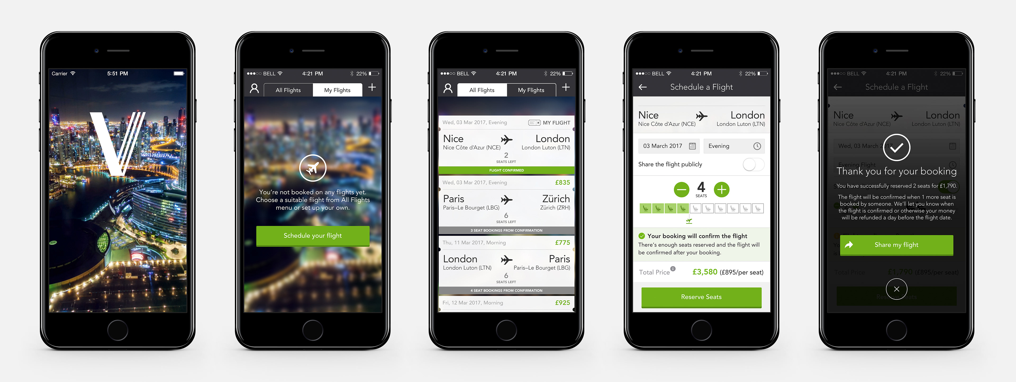
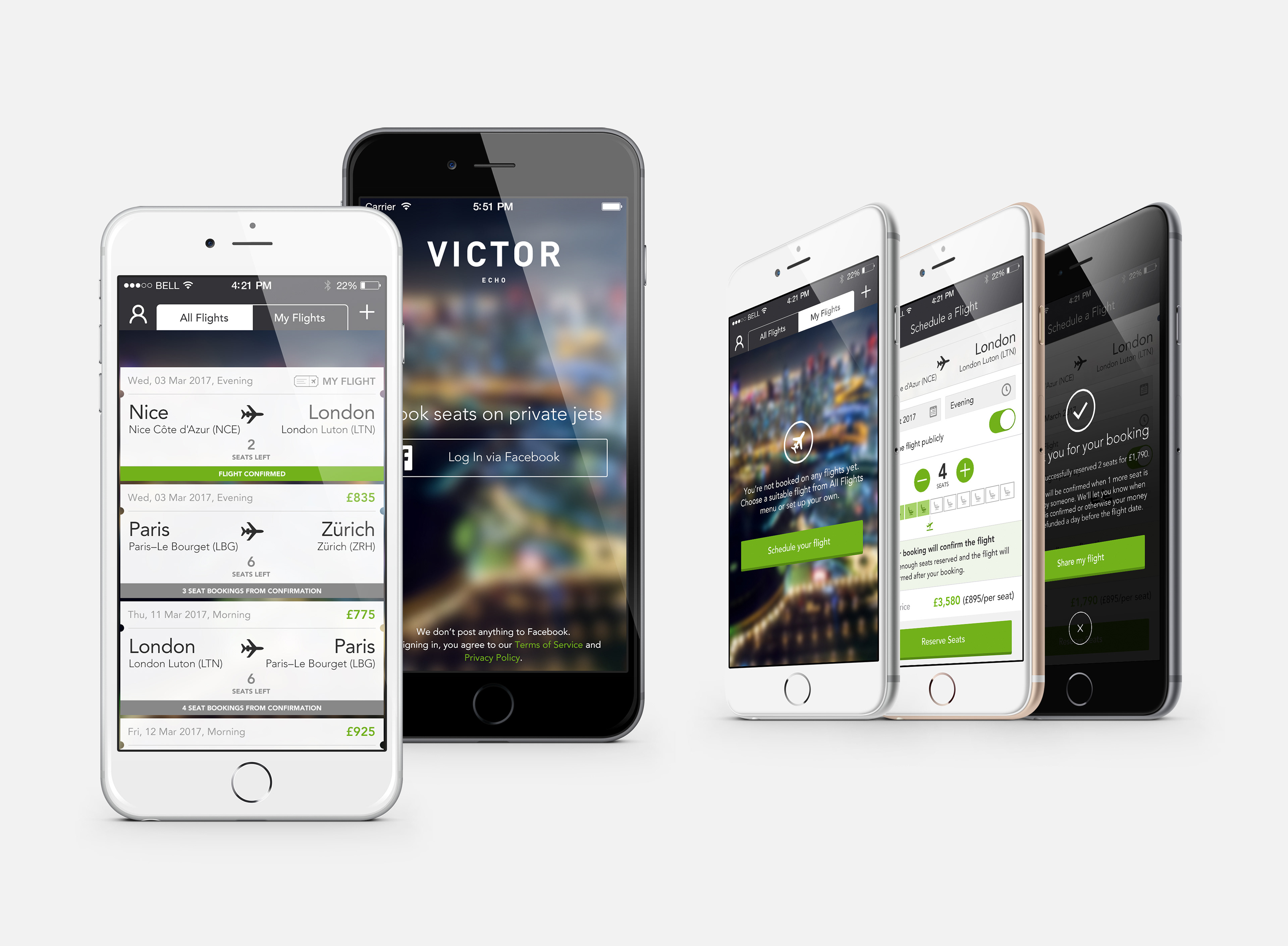
The User Journey
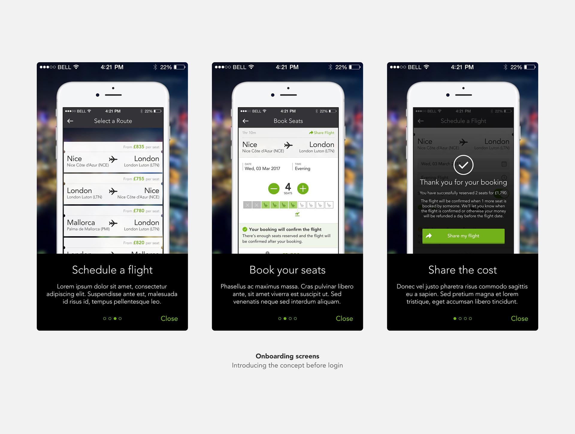
Onboarding – Three screens explaining the concept before login: buy seats on a private jet, share a flight with others, understand the minimum seats model.
Login – Clean brand-forward entry screen with blurred city lights photography, Facebook login, and trust messaging.
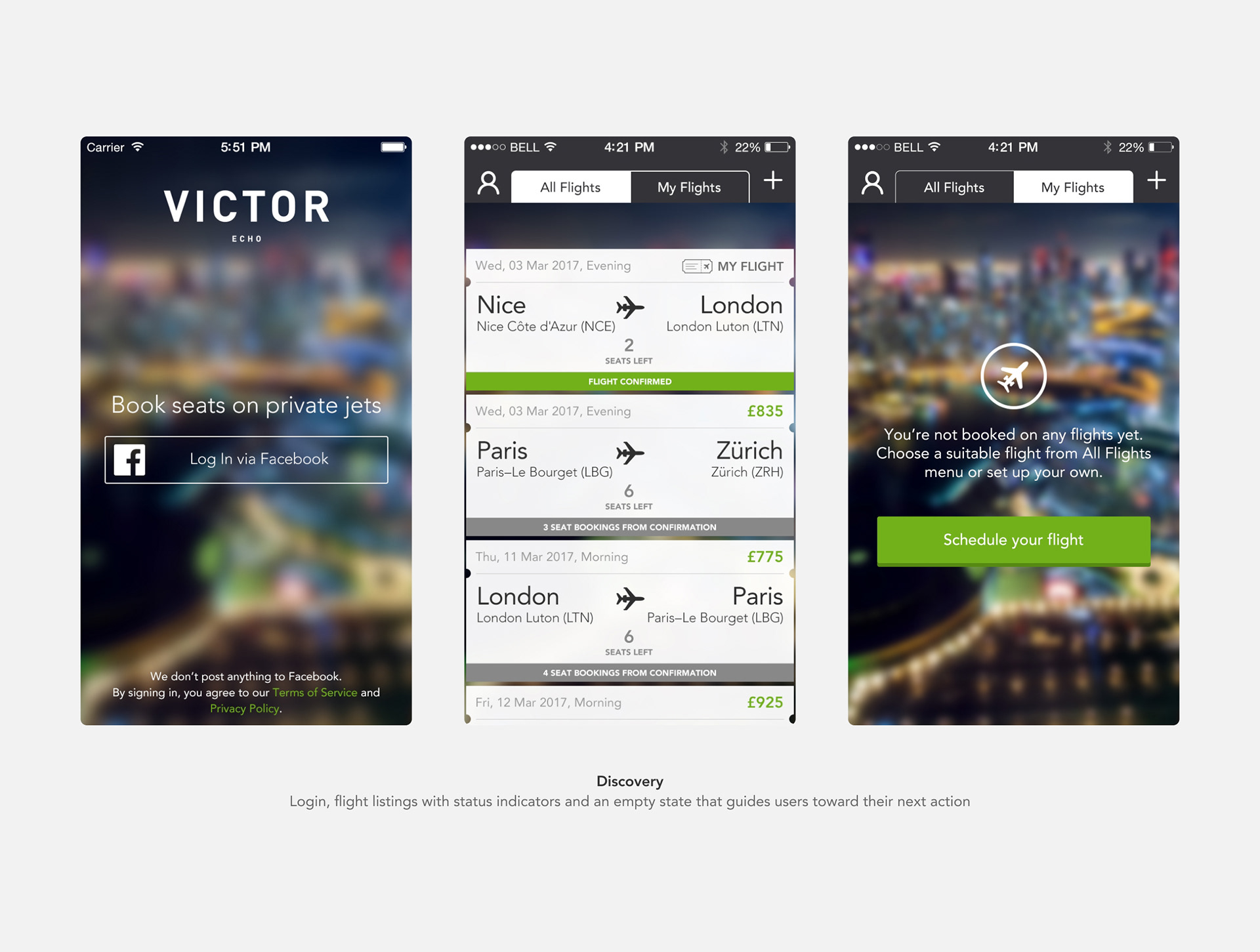
All Flights / My Flights – Tabbed flight list with clear status indicators per card: confirmed (green banner) vs awaiting passengers (grey banner with seats-to-confirmation count). Empty states for both tabs guide users toward action.
Select a Route – Clean list of available routes with per-seat pricing visible at a glance.
Book Seats – The core interaction. Seat selector with status visualisation, dynamic confirmation status banner, Apple Pay integration.
Schedule a Flight – For users creating their own flight. Date, time and privacy toggle, same seat visualisation showing their own seat selection, dynamic status as they adjust seat count.
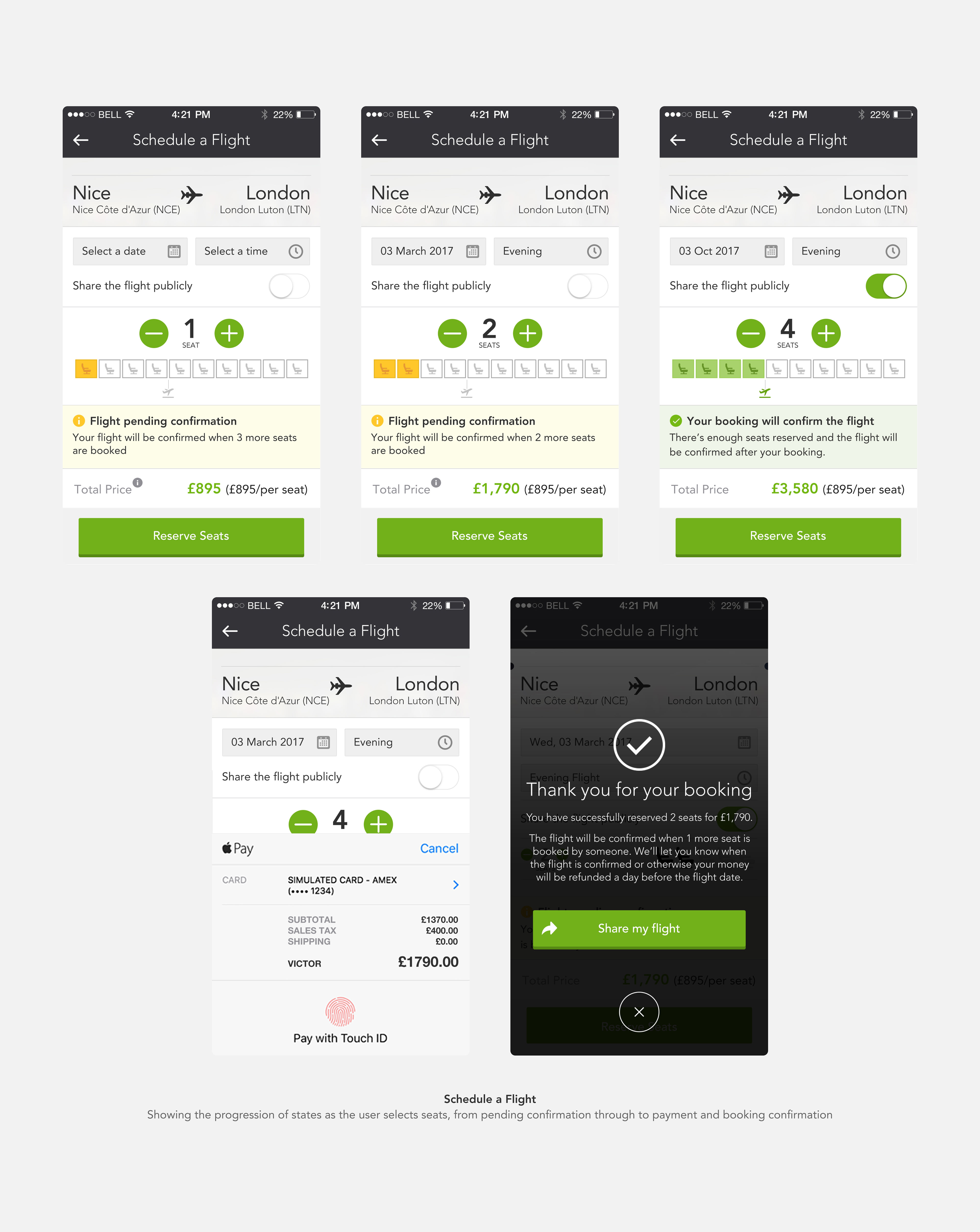
Payment – Apple Pay native sheet, clean and trusted.
Confirmation – Overlay modal confirming the booking with clear communication about the conditional nature of the flight and refund policy. Share CTA to help fill remaining seats.
Flight Details – Three distinct states: not yet booked (with Book Seats CTA), booked but not creator (read-only view), flight creator (with Public Listing toggle and full management view).Design Decisions
Empty states as onboarding
Both the All Flights blank state and My Flights blank state were designed as guiding moments, not just blank screens. They explain the situation and direct users toward the next action.
Honest confirmation messaging
The confirmation screen doesn't just say congratulations – it clearly explains the conditional nature: "The flight will be confirmed when 1 more seat is booked by someone. We'll let you know when the flight is confirmed, or otherwise your money will be refunded." Building trust through transparency.
Role-differentiated views
The Flight Details screen shows meaningfully different information depending on whether you created the flight or just booked it. The flight creator gets a Public Listing toggle to control visibility; other bookers see a read-only view. Same screen, different context.
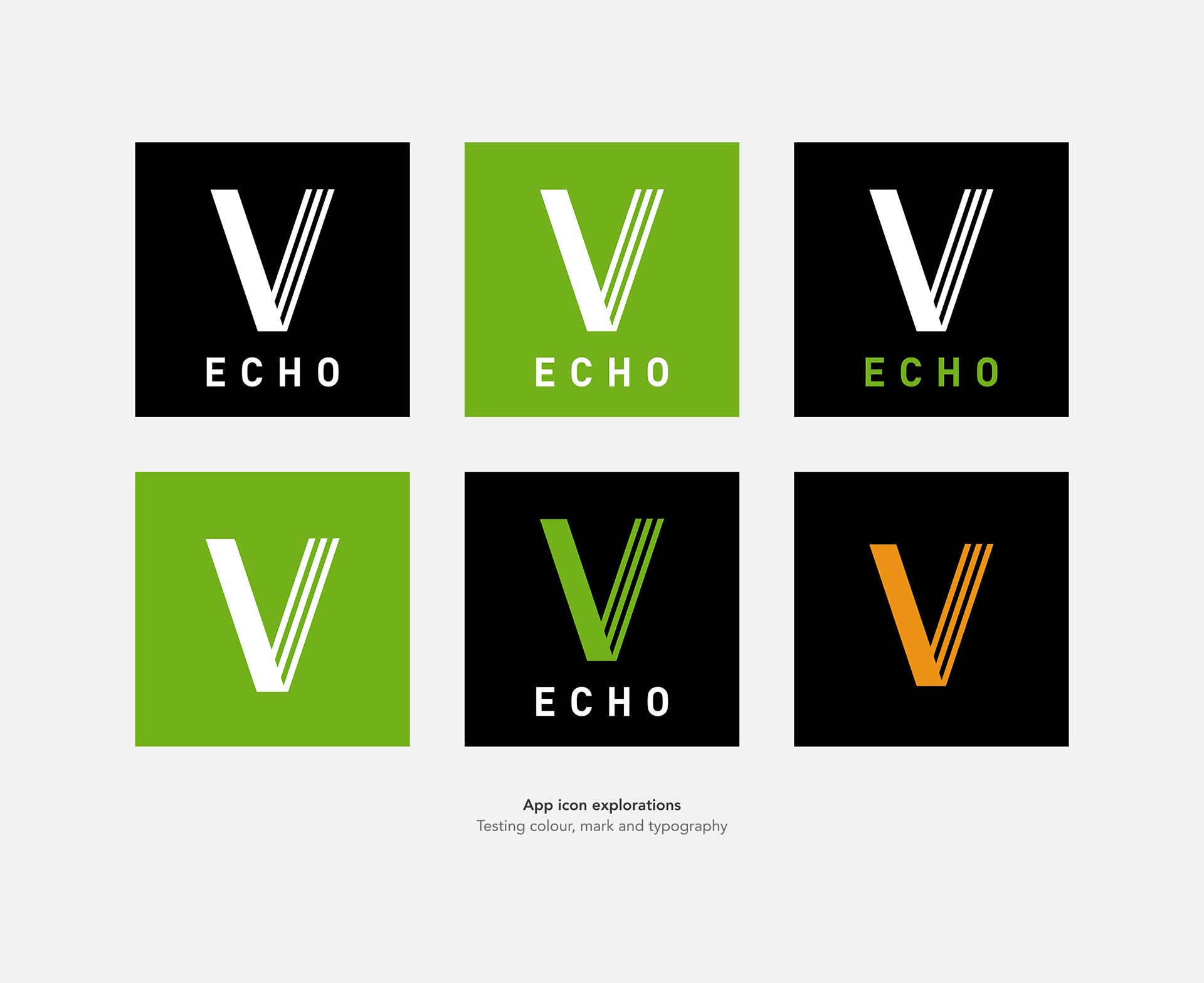
App Icon Exploration
I designed multiple icon concepts exploring colour, mark treatment and typography – testing how Echo could feel connected to the Victor brand while establishing its own identity.
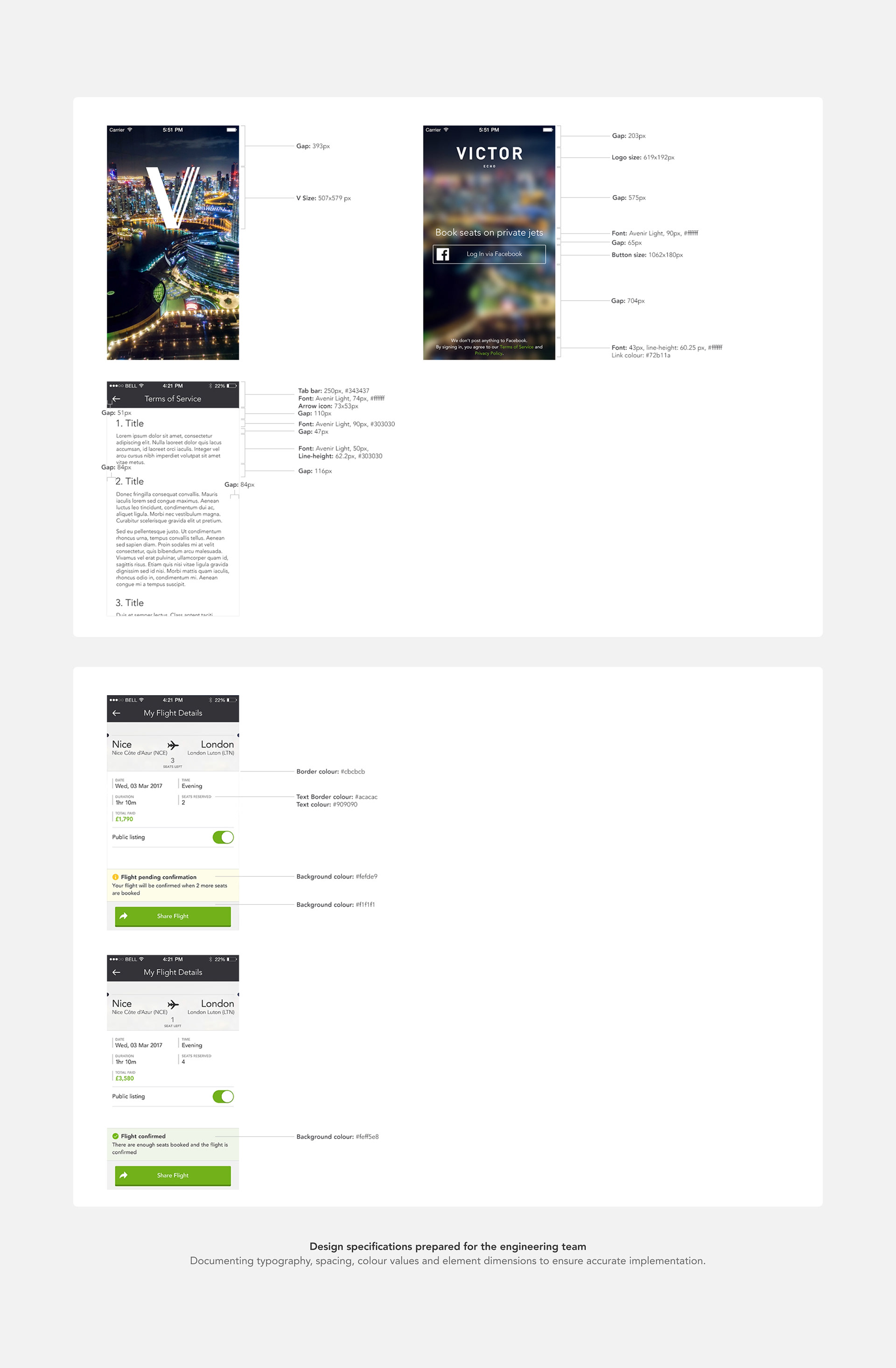
Handoff & Specifications
I prepared detailed stylesheets for the engineering team, documenting exact colour values, spacing, font sizes, line heights and element dimensions for key screens – ensuring the designs could be implemented accurately without ambiguity.